In this post I will be showing my first draft of my digipak that I have made for the album and artist we have created. After showing the pictures of the digipaks and posters I will be analysing them, talking about whether I think if it is conventional to the genre that we have selected, also looking at the colours images and connotations of them. I will talk about whether I think the audience can build a relationship with our artist which is Spencer and he is playing the role of our created artist which is 'Tuscano'. I will evaluate each of my slides by commenting on the following: What choices and decisions did I make and why? Are my choices and decisions conventional to your music genre and why? and what could I change and why? I will talk about my first draft and then talk about my second draft which is the improved version.
My first draft is before we created the artists name and album name together as a team, therefore the first draft of my digipak is called Liquid and the artist is called DJ Julio, however in the second draft it is the artist name and album name that us as a group have decided to use. I will be able to comment on choices and decisions made by relating to the codes and conventions throughout and I will reflect on how my second draft has changed from the first and how it has improved.


The 6 pictures above are my first draft of my digipak, going in order from the front cover, thank you/welcome page, disk, picture slides and the track list slide. Firstly I will have to say that this draft is conventional to the chosen genre of dance, as through out I have used neon-like colours like pinks and greens, mainly on a black background, and this can connote the night-life and nightclubs as they would use neon lighting/colours like in my digipak, therefore relating to the genre of Dance, and the black can also connote rebelliousness which is a convention of dance music and the audience. A good example would have to be the track list page, on this page I have created little pink and green glowing dots, which connote lights and laser beams/strobe lights therefore connoting dance music, which is the purpose of this digipak, to give the impression to the audience that this is a dance album, as this would be recognisable to our target audience, as the would relate and notice, therefore maybe buying this album.
On the front cover I have used laser beams in pink and green to be conventional and connote to dance music. I have also created the title of Liquid to also look quite 'liquidy' by giving it a liquid effect on Photoshop, by doing this it relates with the name, therefore there are visual effects connoting liquid which back up the title, this will make it more memorable to the audience as it gives it originality.
The font that I have used can also relate to the conventions of dance as I have used bubble writing style font, which could connote youth and its informal, this relates to the audience of dance as they would be young adults and teens, around the age of (14 to 25), as they are not formal and usually wear casual clothing and live a casual life by parting; and by making this decision the digipak will make it easier for the audience to connect and relate to it. Also on the 4th slide I have rendered a picture of the artist to have a pixel style to it, this can relate to dance music as pixels relate to computing and electronics, as does dance music as it is usually made on computers and could also sound electronic, it also gives the digipak a better visual effect which will interest the viewers and make them think about connotations. Also he has stars in his eyes, this can relate to drugs 'Seeing stars' which is related to the dance genre, and it could also connote him seeing strobe lights which are also a relation to out genre.
Evaluation
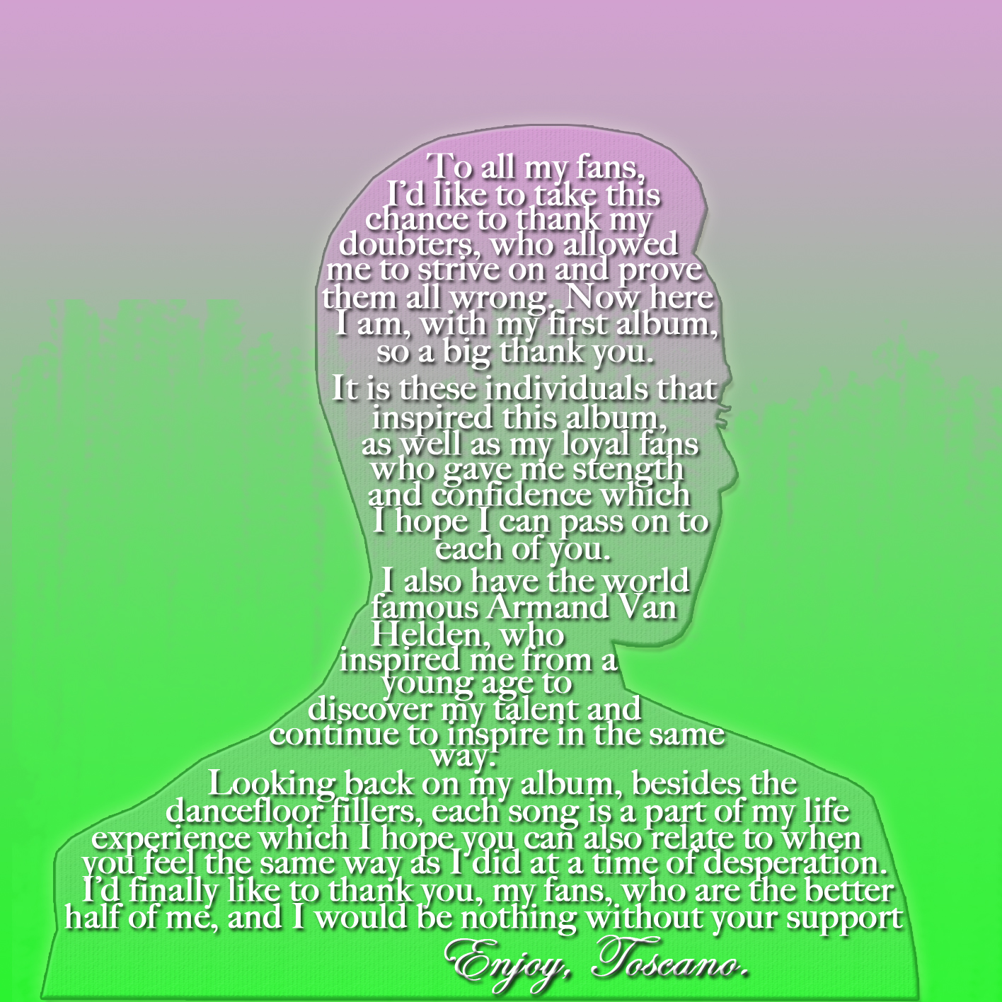
Overall I feel that this draft is conventional to the genre of dance, as I explained. I have made decisions to make the digipak conventional to dance as we are creating a artist and album which is meant to be under the dance genre, by making it conventional, the target audience would recognize that it is dance, and it would attract are target audience which are fans of dance music therefore making sales if this were to be on the market. I have decided to name the album 'Liquid' as this could be seen as smooth, which can relate to dance music being smooth and easy listening. I have also decided to name the artist for this digipak DJ Julio, emphasizing that he is a DJ which relates massively to dance music which is heavily reliant on its instrumentals, which are made/mixed on a turntable by a DJ.
I am happy at how this draft is conventional to the dance genre, however I feel that it could include more, and be a bit more professional in the aesthetics, as this was my first draft I was a starting to learn about Photoshop and in my second draft you can see how I have developed my skills to produce a better digipak. This first draft has made me sure on what colours to use, sticking to bright greens and pinks as they are conventional, I have shown a little bit of editing images in this digipak as you can see how I made the artist pixel styled in the 4th slide, in my next digipak I have shown better/more developed Photoshop skills.
Second Draft
This is the second draft of my digipak. with the second I could make a better digipak, as when I was creating the first I was begging to learn about Photoshop, and in the second I have demonstrated better Photoshop skills, and overall made a better digipak. Scroll downwards to look at the slides which are in chronological order of firstly: front cover, welcome slide, disk, picture slide, second picture slide and track list, and then below I have analysed them.


My second digipak is definitely better than my first digipak. I wanted to show conventions of dance in my digipaks, and I feel I have done that with both digipaks however the second draft does it better and overall it is the better digipak.
The front cover is very conventional to the genre of dance. We have a close up of our artist this connects the audience with him as he is looking right at them, and I have halved his face to be robotic, and this relates to electronics, which relates to the sounds the dance genre creates, and electronics are what the dance music is mainly made with today, relating again. The font of the digipak is all the same, however on some slides they are different colour like on the track list. I have chosen this font as it looks digitalized, something which could be found on a calculator and electronics, and this relates to the dance genre again as being electronic.
Throughout this draft I have used the main colour scheme of bright pink and bright green, I have chosen these colours as they are friendly and visually pleasing, they connote dance music as it reflects a happy persona which is the theme of dance music; living a happy life through partying, also it can be the colours of lasers and strobes which are used at party's, this would be recognisable to the audience as they know what the conventions of their favourite genre is, making them want to buy and listen to the album and our artist.
On most of the slides I have incorporated images which are conventional to dance music, for example on the Disk I have gave it a diagonal line background, the lines are green and the background is black, this can be seen as lasers which can relate to dance music as lasers would be used at a party, and the black background can connote the night-life, which is where most party's are held, at night. In the 4th, 5th and Track list slide i have included a custom brush effect, it looks like orbs, lasers and stars, I have made them in either pink or green to keep with the colour scheme, and this helps the digipak to be balaned in colours and not all random, creating a more professional look, more convincing to the audience that this is a digipak, and therefore this would convince them to buy it.
Evaluation
In conclusion I am very happy about the way my second draft has come out. It is conventional to the genre as I explained. The decisions I made were ones to either enhance the looks of the digipak, or to make it look more conventional and hold connotations of the dance genre as we are creating a dance digipak and therefore attracting the target audience as they would recognise this to be a dance album, and they could consider buying it. I would maybe change one thing and that would be to enhance the contrast of the text with the background as it does slightly clash.