In this post I will analyse the group members digipacks, I will be talking bout about how we shared ideas and our work, I will be analysing my groups digipaks, and talk about its flaws and benfefits, and finally state which digipak we are going to use for our final digipak and why.
Our group has made two digipak drafts each, before we sat down and talk bout about what we should include in the and how they should be structured, we came to the conclusion that it must reflect the dance genre. During the making of them we each asked each other of what can be improved and we gave each other tips and pointers to create a good digipak.


Firstly I would like to say that this digipak is very colourful and therefore it attracts the eye. I like the 4th and 5th page, it is simple yet it creates interest. There has been a consistent use of font throughout the digipak, and the title of the artist on the front page is different and this makes that stand out to the audience. On the second slide 'welcome page' there are highlighted words that provide emphasis for them, he has highlighted the artists that he has stated in the slide, and this creates interest and makes the reader want to read the digipak, it makes it less boring. I also like that on the track list he has made the list in different colours to separate the songs and make it easier to read.
Spencer's Digipak:


I really like this digipak. I like the choice of colours, I remember talking to spencer about using the combination of pink and green as I used it and I thought it was successful. He has stuck to the colour scheme too, he hasn't gone off and started to used loads of colours. I love the front cover, I like how the background looks like sound waves, representing music and the dance genre. I also like how his eyes are glowing, this can relate to laser beams and strobe lights which is something found in party's and is conventional to dance. I like how spencer has used different images to mine, lewis's and sam's digipaks, and I like the welcome page, it is original as he has put the words into the silhouette of him. Also he has included our label company name of Re-Pulse Records, and he has also included a bar code on the track list, this makes it look very professional and people would notice this to be a album. I only feel that the flaws of this digipack are that slide 4 and 5 are a bit plain. And on the welcome slide I feel that the text could be made darker to make it easier to read, as if the audience could not read it, it might discourage the audience and they might not buy it.
Sam's Digipak

This digipak is quite unprofessional I feel personally. I do like how it has connotations of the dance genre, I like the 5th page as it has bold and different colour words that relate to the dance genre. I also like how he has included the Sony BMG logo at the bottom of the track list page. It has random brush strokes to it, and this can be conventional as David Guetta has used this technique and it also symbolises rebelliousness.
Overall I think that this digipak could have been better, I don't really like the random brush strokes. I don't like the colour scheme as it is very random too, and i feel that there should be the same font along the digipak.
After discussion and analysis, we have chose that the final digipak that we will use for our artist is going to be Spencers. We have agreed that we like the colour scheme it is effective and conventional. It also looks professional, by the bar code and the make of the digipak. The editing is also very good, like the glowing of the eyes and the silhouette in the welcome slide. We feel that it would be the best digipak for attracting our audience therefore we have chosen it.


Lewis's Digipak


Firstly I would like to say that this digipak is very colourful and therefore it attracts the eye. I like the 4th and 5th page, it is simple yet it creates interest. There has been a consistent use of font throughout the digipak, and the title of the artist on the front page is different and this makes that stand out to the audience. On the second slide 'welcome page' there are highlighted words that provide emphasis for them, he has highlighted the artists that he has stated in the slide, and this creates interest and makes the reader want to read the digipak, it makes it less boring. I also like that on the track list he has made the list in different colours to separate the songs and make it easier to read.
I font like how he has used too many colours in the digipak, i know we said that bright colourful colours would be used to show dance, yet this is excessive, I don't really like the colour yellow too, and on the second slide the shade of yellow is different to the others and it makes it look unprofessional. I feel that the digipak is too simple, it should include more text or images.
Spencer's Digipak:


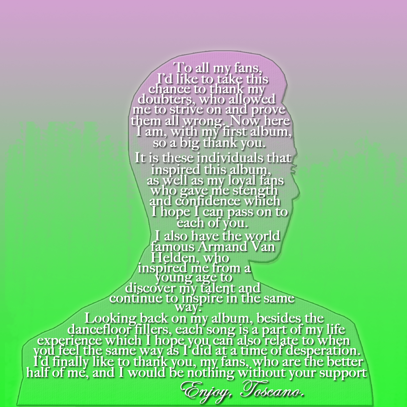


I really like this digipak. I like the choice of colours, I remember talking to spencer about using the combination of pink and green as I used it and I thought it was successful. He has stuck to the colour scheme too, he hasn't gone off and started to used loads of colours. I love the front cover, I like how the background looks like sound waves, representing music and the dance genre. I also like how his eyes are glowing, this can relate to laser beams and strobe lights which is something found in party's and is conventional to dance. I like how spencer has used different images to mine, lewis's and sam's digipaks, and I like the welcome page, it is original as he has put the words into the silhouette of him. Also he has included our label company name of Re-Pulse Records, and he has also included a bar code on the track list, this makes it look very professional and people would notice this to be a album. I only feel that the flaws of this digipack are that slide 4 and 5 are a bit plain. And on the welcome slide I feel that the text could be made darker to make it easier to read, as if the audience could not read it, it might discourage the audience and they might not buy it.
·
This digipak is quite unprofessional I feel personally. I do like how it has connotations of the dance genre, I like the 5th page as it has bold and different colour words that relate to the dance genre. I also like how he has included the Sony BMG logo at the bottom of the track list page. It has random brush strokes to it, and this can be conventional as David Guetta has used this technique and it also symbolises rebelliousness.
Overall I think that this digipak could have been better, I don't really like the random brush strokes. I don't like the colour scheme as it is very random too, and i feel that there should be the same font along the digipak.
After discussion and analysis, we have chose that the final digipak that we will use for our artist is going to be Spencers. We have agreed that we like the colour scheme it is effective and conventional. It also looks professional, by the bar code and the make of the digipak. The editing is also very good, like the glowing of the eyes and the silhouette in the welcome slide. We feel that it would be the best digipak for attracting our audience therefore we have chosen it.
This post demonstrates good group planning and this is because this post demonstrates the discussions that your group had with each digipak design and why you decided on using Spencer's.
ReplyDeleteI know that you have also discussed your design, but also aim to include your digipak too