Friday, 7 December 2012

Diversity In Music Videos

In this post i will be talking about diverse music videos. Diversity in music video means they are usually different and  they do not conform to conventions of their genre and what we expect to see in a typical music video, for example Lady Gaga making a music video that is not conventional to the pop genre and different to what we are used to seeing in music videos. Michael Gondry and Chris Cunningham are both directors that produce diverse music videos. The reason for making these types of music videos is to mainly make them stand out as it intrigues audiences as its something different and fresh. As the music video is different to most of the others in a certain genre for example then their video will be remembered more easily, and it might make the audiences want to watch it more than once as its interesting. I will analyze a diverse music videos and talk about their characteristics and how they are diverse to typical music videos.

Madonna - Frozen

This video from Madonna is a diverse music video. The video consists of Madonna singing and performing a sort of ritual dance in a desert landscape. The whole video is shot in this desert landscape and does not change, this is for one different to stereotypical music videos as they would have many locations in the video. By keeping it in the desert it holds a type of isolating presence, which puts the viewer in a certain mood, also there is a dark blue tint on the video which makes it dull and drains the colour, and this can also add to the type of dark depressing theme, and this is another difference to conventional videos as they would usually be happy and bright.

Witchcraft connotations, the tattoos and costume/dark blue tint.


Goodwins theory is not evident in this video, which makes it unique as his theory does not exist for this video, making expectations for this video to become reversed, as its not a stereotypical music video. However you could say that there is a little relation to the lyrics and the visuals, as 'Frozen' is said in the video and is the title, and the visuals are blue and dark, connoting an icy theme. The structure of the video is similar throughout, shots of Madonna floating and performing is consistent throughout, while there are little differences in shots when she turns into animals, like crows and a black dog. Madonna is represented as cold in this video, she has a neutral representation as she is not doing anything bad in it, however her actions and symbolism, like the tattoo's on her hand and costume can arouse stereotypes of witchcraft, which some people can find negative and it is not usually seen in music videos, making it different. She also morphs into animals in the video, like birds, connotes that she could be free, either way, the video, Madonnas representation  costume and actions make this video unique and it breaks apart from the stereotypes of music videos, making it diverse.

Summary

Diverse music videos are music videos that do not conform to the stereotypes of conventional music videos, so they are diverse and unique. By being diverse, the music video stands out as it is original and different, therefore people would be more interested and attracted to it as its different, and it will be remembered better, as it is unique, so if someone wants to watch it again, they know what song it is, therefore giving the artist more money by viewing their video, which can be on YouTube. We decided to not make a diverse music video in the sense that it wont be conventional, we want to make ours conventional as it will be recognized as a dance music video so it will be effective.


Thursday, 6 December 2012

Groups Digipaks Analysis


In this post I will analyse the group members digipacks, I will be talking bout about how we shared ideas and our work, I will be analysing my groups digipaks, and talk about its flaws and benfefits, and finally state which digipak we are going to use for our final digipak and why.
Our group has made two digipak drafts each, before we sat down and talk bout about what we should include in the and how they should be structured, we came to the conclusion that it must reflect the dance genre. During the making of them we each asked each other of what can be improved and we gave each other tips and pointers to create a good digipak.


Lewis's Digipak


Firstly I would like to say that this digipak is very colourful and therefore it attracts the eye. I like the 4th and 5th page, it is simple yet it creates interest. There has been a consistent use of font throughout the digipak, and the title of the artist  on the front page is different and this makes that stand out to the audience. On the second slide 'welcome page' there are highlighted words that provide emphasis for them, he has highlighted the artists that he has stated in the slide, and this creates interest and makes the reader want to read the digipak, it makes it less boring. I also like that on the track list he has made the list in different colours to separate the songs and make it easier to read.

I font like how he has used too many colours in the digipak, i know we said that bright colourful colours would be used to show dance, yet this is excessive, I don't really like the colour yellow too, and on the second slide the shade of yellow is different to the others and it makes it look unprofessional. I feel that the digipak is too simple, it should include more text or images.

Spencer's Digipak:


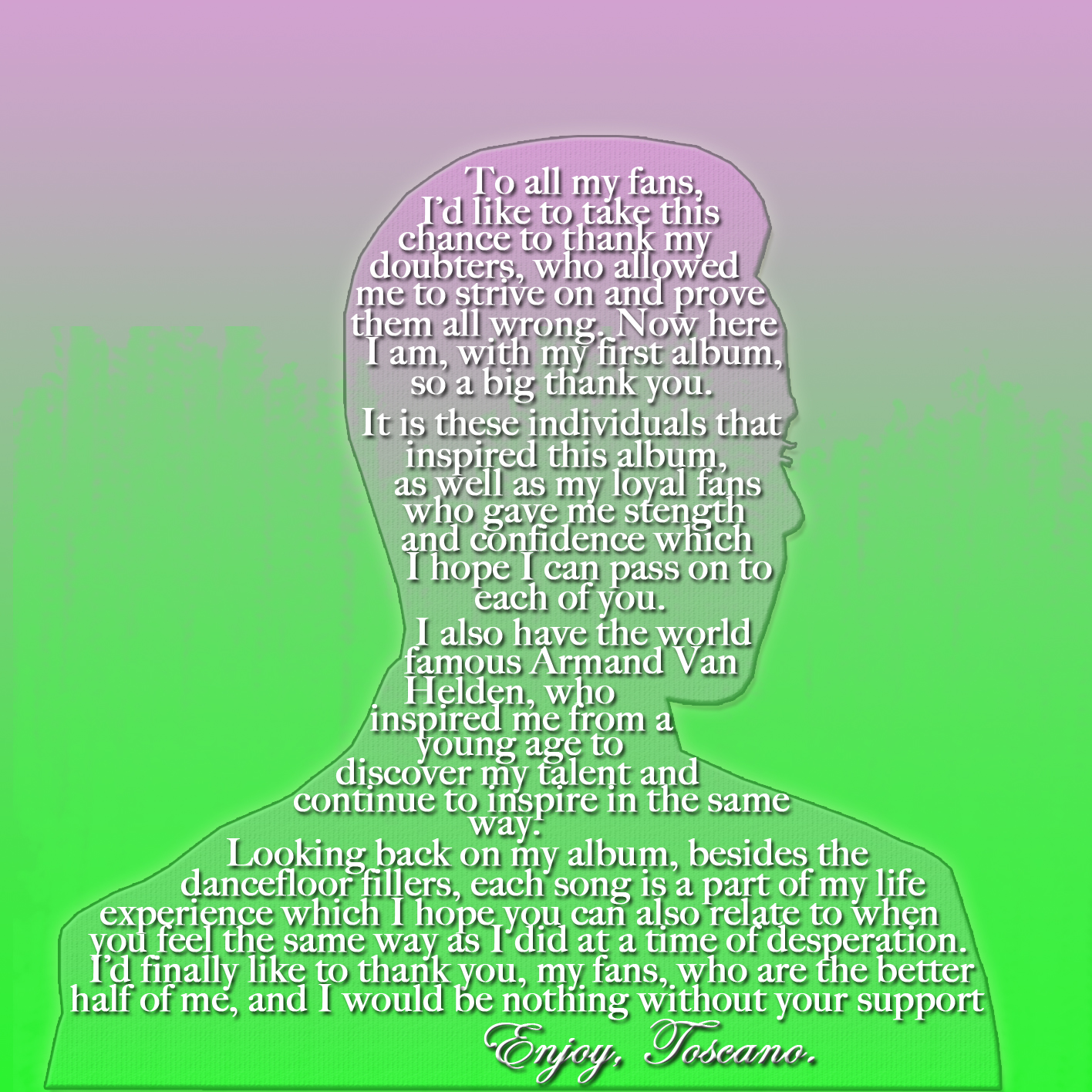
I really like this digipak. I like the choice of colours, I remember talking to spencer about using the combination of pink and green as I used it and I thought it was successful. He has stuck to the colour scheme too, he hasn't gone off and started to used loads of colours. I love the front cover, I like how the background looks like sound waves, representing music and the dance genre. I also like how his eyes are glowing, this can relate to laser beams and strobe lights which is something found in party's and is conventional to dance. I like how spencer has used different images to mine, lewis's and sam's digipaks, and I like the welcome page, it is original as he has put the words into the silhouette of him. Also he has included our label company name of Re-Pulse Records, and he has also included a bar code on the track list, this makes it look very professional and people would notice this to be a album. I only feel that the flaws of this digipack are that slide 4 and 5 are a bit plain. And on the welcome slide I feel that the text could be made darker to make it easier to read, as if the audience could not read it, it might discourage the audience and they might not buy it.
·    
Sam's Digipak


This digipak is quite unprofessional I feel personally. I do like how it has connotations of the dance genre, I like the 5th page as it has bold and different colour words that relate to the dance genre. I also like how he has included the Sony BMG logo at the bottom of the track list page. It has random brush strokes to it, and this can be conventional as David Guetta has used this technique and it also symbolises rebelliousness.

Overall I think that this digipak could have been better, I don't really like the random brush strokes. I don't like the colour scheme as it is very random too, and i feel that there should be the same font along the digipak.

After discussion and analysis, we have chose that the final digipak that we will use for our artist is going to be Spencers. We have agreed that we like the colour scheme it is effective and conventional. It also looks professional, by the bar code and the make of the digipak. The editing is also very good, like the glowing of the eyes and the silhouette in the welcome slide. We feel that it would be the best digipak for attracting our audience therefore we have chosen it.


Groups Magazine/Adverts Analysis

In this post I will talk about the group member adverts, I will talk about their good points and their bad points, and if they are conventional etc. I will then say which advert we chose to be the final advert as a group. We all gave each other constructive criticism while making our adverts, we gave tips and helped eachother make a quality final advert.

Spencers advert:

This poster looks very good ad it has a professional feel, convincing me and the audience that it is a real poster, and this is very effective. He has used the color scheme of pinks and greens which are both very effective is conveying the dance genre, as they are fun and vibrant, relating to the conventions of dance music; to have fun partying and living the good life, by making the poster hold conventions of dance music, it would attract our target audience, as they would notice that it is a dance advert. The colours are also very eye catching and this could attract other audiencences by making them want to read the poster due to its cool colours.

The poster has the image of the artist that we took, which is the close up of his face, spencer has used this 5 times in this poster, and this emphasises to the audience that he is the artist, and it gives them a connection with the artist too as he is looking directly into the eyes of the audience looking at the poster. Along the bottom of the poster spencer has put his draft of his digipak 4 times, this makes the audience want to look at this,a and then it gives them an print of the album in their mind and this will help them notice the album in the shops if they would want to buy it, as this poster is an advert for the artist, it does this very well as I just explained. In the eyes of the artist there is a music symbol and there is also a spark in his eyes, this can convey that the artist is well dedicated to his music as it is in his eyes, and this can make the artist connect with the audience further, as they would find him to be admirable, as he has a full dedication to music.

The images of edits on the images of the artist make the artist look almost electronic or robot orientated, and this can relate to the dance genre, as the sounds of dance are made with electronics and they also sound electronically themed and relate to robots again as they are electronic based. I feel that this is a very good poster, it is convincing that it is an advert and it hold conventions of adverts to, in dance adverts there would usually be a close up of the artist in the poster, this would take up either half or more of the poster, and then there would be information on the poster, like the date and the album name. 
 
I cannot think about many flaws to this poster, and this makes it a good poster for that reason however if I were to name one that i have thought about very hard then it would have to be albums along the bottom, maybe he could have made an outline around them separately as they clash with each other.


Sams Poster:


This poster is also convincing that it is a advert however it does not look as good as spencers poster. I would like to start on saying that I like the background, it is green and in the form of diagonal striped, and this can connote lasers or strobe lights which are used in party's, and this relates to the genre of dance. The poster has has displayed conventions of dance quite well, for example the text used looks digitalized in places, and this can relate to the music that the dance genre produces, its electronic. I also like how he has included contact details, he has included Toscanos twitter account and email address, this can let the audience follow him and send him emails, and this makes them connect with the artist further as they could see into his life and what he gets up to on a daily basis. By including his twitter account it can let hi get more followers by the advertising of this poster, therefore this poster is good as it advertises the artist and can promote him by using twitter.

I like how Sam has used the sparling on the 'Meet the Beat' title, it has codes and conventions of dance music, as it connotes disco balls, which are used at party's. The colour of the font can also relate to the dance genre, it is light blue and this can be seen as a vibrant colour and this can give a friendly appearance to the poster, making it look joyous and happy which are conventions of the dance genre, living the good life and partying most of the time. At the bottom left of the page Sam has included his digipak draft, and this would inform the target audience of what the album looks like, so they would recognise it in the shops and they would consider buying it, this is a good piece of advertising in the poster. The picture that Sam has used in a mid shot of the artist, and he is looking straight into the lens, making the audience connect it the audience as it looks like he is looking at the audience and this involves them thoroughly with the advert, it is important that the audience connect with the artist as this is the main selling point of music, if the audience do not connect and dislike the artist then they would not buy his album. Also has stated in the poster 'Including the Smash hit, well be coming back' this makes convinces the audience that his song is a smash hit and it a good song, this can also convince them into buying the album.

The flaws of this poster are mainly on the design and the editing, we can see that the crop of the picture of the artist is not fully done, as we can see the floor of where the picture was taken in-between his arms and torso. Also there is a little cross on his right shoulder and this looks like it should not be there. He has used many font styles and I feel that it would be better to keep with the same font which is conventional to the dance genre.

Lewis's Advert:

This advert is different from the rest in a sense that it would not be as popular or effective as the other two. The advert is quite simple, this could be seen as good but it could include more things, like effects and text, as I feel that it does not show enough conventions of dance music. Th font does however hold connotations as it is a digital font, and this can relate to the electronic sounds and orientation that dance music is based around. The font is also green and this can connote lasers and health, and this relates to the dance genre as laser would be used in party's. The glow of the font would also connote night-life and this is a prime relation to dance conventions and the audience as they would be out at night looking to party.

The poster shows the artists name and a song that is included in the album and it also says how it is 'out now' however I feel that this is not enough information for the audience, lewis could have included a picture of one of his digipaks so the audience would know what the artists album looks like, and also the audience would not know where to buy this album as the poster does not display where you can get it. The background id plain and boring and i feel that the audience would not be interested in the poster, and this is a problem as the purpose of the poster is to advertise and promote the artist to the audience and a way to do this is to make the audience want to read the poster and to be interested. Therefore I feel that this is not a good poster to use.

As a group we have all analysed our work and adverts, and we have came with the decision to use Spencer's advert. We thought that out of all of our adverts that Spencers was the best in all the categories that we said we had to hit while making these adverts: Advertising of the artist and album, design/good editing and to convey dance and be conventional to dance. The advert is very conventional, it is eye catching and it promoted the artist and his album, also the colours used are for both genres so it can target a larger audience. The advert also looks very professional, and this makes in convincing that it could be a real advert.

Tuesday, 4 December 2012

My Poster Analysis.

In this post I will analyse my own poster/advert draft for our artist. I will talk about the decisions I have made and if I feel that it hold conventions/codes of our genre, if it is effective and I will evaluate my thought at the end. I will display and talk bout my first poster and the show my second and talk about changes and how I have improved my poster.
Some: will be able to comment on choices and decisions made by relating to the codes and conventions throughout and by reflecting on changes that are going to be made on the second draft (Grade A)

This is the first draft that I have created. I have created this poster to be conventional to the dance genre. I have included vibrant colours like green and pinks at in the poster to represent a youthful and energetic approach, which relates to the convention of the dance genre, and the audience of dance, as they would be young and energetic by going out a enjoying life through partying. I have created this poster to look like a real poster, as from making research of real posters from a previous post, the posters usually contained 50 percent of the poster containing a picture, usually a close up of the artist, as we have, and the other half containing information about the artist, like album name and where you can get the album.

The top half of the poster has been created to look like the album of the artist, so when the poster interests the audience and makes them want to buy it, they will know what it looks like in the stores. I have used a diagonal line effect on the bottom half, and this connotes lasers which would be used at party's, where our target audience would party to their favourite genre which is dance, and by including the lasers, it will be conventional, and the audience will recognise that its a dance poster.

This is the second draft of my advert has been a improvement from the second. I have evaluated the first draft and this draft is the improved version. This poster connotes and hold more conventions of dance music more than the first draft by its text and colors. The text font in this draft holds a better dance connotation as it looks digital and this relates to the sound of the music in the dance genre. The colors are much more vibrant and eye-catching, representing a happy and youthful theme, which relates to the genre and their audience, as they would live a happy life through partying and they are youthful.

Film Schedule

In this post I will talk about how it is important to have a film schedule, I will include our film schedule and say whether we used it and if we made any changes.

I feel that it is important to have a film schedule as this is the plan list of shots that we would be using to in our video, and when we are out filming we would take a printed version of this out with us to remind us of the shots we needed to film. As we are filming our video we would tick off the shots and scenes that are on the list, by doing this it will make us much more organized and it has sectioned out what shots and scenes where needed to be filmed.


Risk Management

In this post I will talk about the Risk Management that we will be taking in consideration. We have made a document with table of the risks and the procedures to prevent the risk. I will talk about how it is important to take in considerations of the risks that might be provoked when we are filming, and how it will help us with filming.

Risks can cause equipment damage
I think that discussing risks before going out to film is very important, health and safety is very important as we would not want anyone getting hurt. Also there would be risks with the filming, like the white balance for example. By making a document with a table consisting of the risks that we can consider and the procedures that we will take to prevent them, this will help us with the filming of our video as we will be aware of the risks, and will prevent any setbacks that these risks could cause.


Tuesday, 27 November 2012

Digipack Draft and Analysis

In this post I will be showing my first draft of my digipak that I have made for the album and artist we have created. After showing the pictures of the digipaks and posters I will be analysing them, talking about whether I think if it is conventional to the genre that we have selected, also looking at the colours images and connotations of them. I will talk about whether I think the audience can build a relationship with our artist which is Spencer and he is playing the role of our created artist which is 'Tuscano'. I will evaluate each of my slides by commenting on the following: What choices and decisions did I make and why? Are my choices and decisions conventional to your music genre and why? and what could I change and why? I will talk about my first draft and then talk about my second draft which is the improved version.

My first draft is before we created the artists name and album name together as a team, therefore the first draft of my digipak is called Liquid and the artist is called DJ Julio, however in the second draft it is the artist name and album name that us as a group have decided to use. I will be able to comment on choices and decisions made by relating to the codes and conventions throughout and I will reflect on how my second draft has changed from the first and how it has improved.


The 6 pictures above are my first draft of my digipak, going in order from the front cover, thank you/welcome page, disk, picture slides and the track list slide. Firstly I will have to say that this draft is conventional to the chosen genre of dance, as through out I have used neon-like colours like pinks and greens, mainly on a black background, and this can connote the night-life and nightclubs as they would use neon lighting/colours like in my digipak, therefore relating to the genre of Dance, and the black can also connote rebelliousness which is a convention of dance music and the audience. A good example would have to be the track list page, on this page I have created little pink and green glowing dots, which connote lights and laser beams/strobe lights therefore connoting dance music, which is the purpose of this digipak, to give the impression to the audience that this is a dance album, as this would be recognisable to our target audience, as the would relate and notice, therefore maybe buying this album.

On the front cover I have used laser beams in pink and green to be conventional and connote to dance music. I have also created the title of Liquid to also look quite 'liquidy' by giving it a liquid effect on Photoshop, by doing this it relates with the name, therefore there are visual effects connoting liquid which back up the title, this will make it more memorable to the audience as it gives it originality.

The font that I have used can also relate to the conventions of dance as I have used bubble writing style font, which could connote youth and its informal, this relates to the audience of dance as they would be young adults and teens, around the age of (14 to 25), as they are not formal and usually wear casual clothing and live a casual life by parting; and by making this decision the digipak will make it easier for the audience to connect and relate to it. Also on the 4th slide I have rendered a picture of the artist to have a pixel style to it, this can relate to dance music as pixels relate to computing and electronics, as does dance music as it is usually made on computers and could also sound electronic, it also gives the digipak a better visual effect which will interest the viewers and make them think about connotations. Also he has stars in his eyes, this can relate to drugs 'Seeing stars' which is related to the dance genre, and it could also connote him seeing strobe lights which are also a relation to out genre.

Evaluation
Overall I feel that this draft is conventional to the genre of dance, as I explained. I have made decisions to make the digipak conventional to dance as we are creating a artist and album which is meant to be under the dance genre,  by making it conventional, the target audience would recognize that it is dance, and it would attract are target audience which are fans of dance music therefore making sales if this were to be on the market. I have decided to name the album 'Liquid' as this could be seen as smooth, which can relate to dance music being smooth and easy listening. I have also decided to name the artist for this digipak DJ Julio, emphasizing that he is a DJ which relates massively to dance music which is heavily reliant on its instrumentals, which are made/mixed on a turntable by a DJ.

I am happy at how this draft is conventional to the dance genre, however I feel that it could include more, and be a bit more professional in the aesthetics, as this was my first draft I was a starting to learn about Photoshop and in my second draft you can see how I have developed my skills to produce a better digipak. This first draft has made me sure on what colours to use, sticking to bright greens and pinks as they are conventional, I have shown a little bit of editing images in this digipak as you can see how I made the artist pixel styled in the 4th slide, in my next digipak I have shown better/more developed Photoshop skills.

Second Draft

This is the second draft of my digipak. with the second I could make a better digipak, as when I was creating the first I was begging to learn about Photoshop, and in the second I have demonstrated better Photoshop skills, and overall made a better digipak. Scroll downwards to look at the slides which are in chronological order of firstly: front cover, welcome slide, disk, picture slide, second picture slide and track list, and then below I have analysed them.


My second digipak is definitely better than my first digipak. I wanted to show conventions of dance in my digipaks, and I feel I have done that with both digipaks however the second draft does it better and overall it is the better digipak.

The front cover is very conventional to the genre of dance. We have a close up of our artist this connects the audience with him as he is looking right at them, and I have halved his face to be robotic, and this relates to electronics, which relates to the sounds the dance genre creates, and electronics are what the dance music is mainly made with today, relating again. The font of the digipak is all the same, however on some slides they are different colour like on the track list. I have chosen this font as it looks digitalized, something which could be found on a calculator and electronics, and this relates to the dance genre again as being electronic.

Throughout this draft I have used the main colour scheme of bright pink and bright green, I have chosen these colours as they are friendly and visually pleasing, they connote dance music as it reflects a happy persona which is the theme of dance music; living a happy life through partying, also it can be the colours of lasers and strobes which are used at party's, this would be recognisable to the audience as they know what the conventions of their favourite genre is, making them want to buy and listen to the album and our artist.

On most of the slides I have incorporated images which are conventional to dance music, for example on the Disk I have gave it a diagonal line background, the lines are green and the background is black, this can be seen as lasers which can relate to dance music as lasers would be used at a party, and the black background can connote the night-life, which is where most party's are held, at night. In the 4th, 5th and Track list slide i have included a custom brush effect, it looks like orbs, lasers and stars, I have made them in either pink or green to keep with the colour scheme, and this helps the digipak to be balaned in colours and not all random, creating a more professional look, more convincing to the audience that this is a digipak, and therefore this would convince them to buy it.

Evaluation

In conclusion  I am very happy about the way my second draft has come out. It is conventional to the genre as I explained. The decisions I made were ones to either enhance the looks of the digipak, or to make it look more conventional and hold connotations of the dance genre as we are creating a dance digipak and therefore attracting the target audience as they would recognise this to be a dance album, and they could consider buying it. I would maybe change one thing and that would be to enhance the contrast of the text with the background as it does slightly clash.